GregorTacTac@lemm.ee to Programmer Humor@programming.dev · 28 days agoAverage CSSlemm.eeimagemessage-square84fedilinkarrow-up1563arrow-down119file-text
arrow-up1544arrow-down1imageAverage CSSlemm.eeGregorTacTac@lemm.ee to Programmer Humor@programming.dev · 28 days agomessage-square84fedilinkfile-text
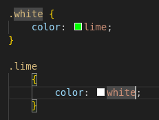
minus-squarePeter_Arbeitsloser@feddit.orglinkfedilinkarrow-up34·27 days agoIsn’t cascading styles the whole point of Cascading Style Sheets?
minus-square_stranger_@lemmy.worldlinkfedilinkarrow-up27arrow-down1·edit-227 days agoYou absolute fool. You must never utter its full name, lest you summon its wrath!
minus-squarewizzor@sopuli.xyzlinkfedilinkarrow-up14·27 days agoI don’t get it, isn’t this a pretty normal way of using media queries. Granted you’re more likely to see the widths defined in px.
minus-squareByteOnBikes@slrpnk.netlinkfedilinkarrow-up11arrow-down1·27 days agoShhh… The poster doesn’t understand CSS and we shouldn’t embarrass them in a community with memes
minus-squarewizzor@sopuli.xyzlinkfedilinkEnglisharrow-up4·26 days agoMy imposter syndrome kicked in full swing. I was ready to learn a CSS best practice and feel uncomfortable about it for the rest off the day.
minus-squareMonkderVierte@lemmy.mllinkfedilinkarrow-up1·18 days agoNowadays we do responsive webdesign instead of micromanaging widths.
minus-squareusernamefactory@lemmy.calinkfedilinkarrow-up2·18 days agoThis is technically responsive, but I think you have a fair criticism. A single rule like this would be much more maintainable: #content .grid-container { width: 90vw; min-width: 12rem; max-width: 75rem; padding: 2rem 0 1rem; } Obviously, media rules have their place, but not for something that’s consistantly a full width container like this seems to be.


Worse.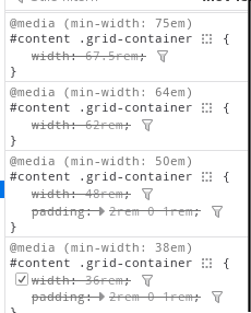
Isn’t cascading styles the whole point of Cascading Style Sheets?
You absolute fool. You must never utter its full name, lest you summon its wrath!
I don’t get it, isn’t this a pretty normal way of using media queries. Granted you’re more likely to see the widths defined in px.
Shhh… The poster doesn’t understand CSS and we shouldn’t embarrass them in a community with memes
My imposter syndrome kicked in full swing. I was ready to learn a CSS best practice and feel uncomfortable about it for the rest off the day.
Nowadays we do responsive webdesign instead of micromanaging widths.
This is technically responsive, but I think you have a fair criticism. A single rule like this would be much more maintainable:
#content .grid-container {
	width: 90vw;
	min-width: 12rem;
	max-width: 75rem;
	padding: 2rem 0 1rem;
}
Obviously, media rules have their place, but not for something that’s consistantly a full width container like this seems to be.