Bro its so easy bro, just use flexboxgridcolumns its been a standard since 2010 just flex it bro you haven’t learned to flex yet just check w3c schools and add a flex you can polyfill it but don’t use that hacked one use the good flexpolyfill then { content-align-middle-child-elements: center-middle-true-neutral } so easy with flex bro
I know you meant this sarcastically, but yes, flex is a good option for centering something. Either that or setting the left and right margins of the element to auto, which is generally even easier.
Basically, if you’re in a flex container use flex, if you’re in a grid use grid, and if neither of those apply set the left and right margins to auto.
I’m not sure there’s any version of it for grids, but IMO grids are inherently more intuitive, so it may not be needed. Flexbox is the one that is hard to learn.
Well, flexbox and grid have different purposes in my opinion/experience. Personally I use grid for “top level” layouts like the layout of the whole site, while I tend to prefer flexbox for layouts inside the grid. Of course that’s just a rule of thumb, there are absolutely cases where this isn’t the best option.
Sure. Here you go. The green container should cover all red boxes in both cases. I’ve been bashing my head against this issue for a while, but, as far as I understand, this is a bug that’s never going to be fixed. Which sucks, because I wanted to re-design some of the apps in the horizontal metro-style scrolling manner for the bottom screen on my zephyrus duo, but this effectively prevents me from doing so (Unless I use grids and set positions manually).
Chromium is a superior engine, yes. But Chrome itself, at least in my eyes, looks to be the least capable browser out of the bunch. I’d rather Vivaldi if I had to switch.
EDIT: Alright, this is a terrible case because the parent element has flex and therefore no inline-flex is necessary there, but I’d argue it’s the parent element being flex that is redundant, rather than child element being inline.
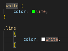
Inline means that your element should be treated like text. If your element is not text, then you shouldn’t use inline. In this screenshot the element is text, so it’s ok.


Bro its so easy bro, just use flexboxgridcolumns its been a standard since 2010 just flex it bro you haven’t learned to flex yet just check w3c schools and add a flex you can polyfill it but don’t use that hacked one use the good flexpolyfill then { content-align-middle-child-elements: center-middle-true-neutral } so easy with flex bro
I know you meant this sarcastically, but yes, flex is a good option for centering something. Either that or setting the left and right margins of the element to auto, which is generally even easier.
Basically, if you’re in a flex container use flex, if you’re in a grid use grid, and if neither of those apply set the left and right margins to auto.
Also seriously, anybody having problems with flexbox should try this:
https://flexboxfroggy.com/
I’m not sure there’s any version of it for grids, but IMO grids are inherently more intuitive, so it may not be needed. Flexbox is the one that is hard to learn.
Well, flexbox and grid have different purposes in my opinion/experience. Personally I use grid for “top level” layouts like the layout of the whole site, while I tend to prefer flexbox for layouts inside the grid. Of course that’s just a rule of thumb, there are absolutely cases where this isn’t the best option.
I don’t know any CSS (despite reading memes about it like this) but I do know that the bottom of that page has a link to something called Grid Garden
Also exists as Tower Defense
Dude, stop flexing on him. You’re gonna make him cry.
You’ve perfectly captured twitter tech bro energy it’s kind of incredible actually
It’s 2024 and flexboxes still don’t work that well with vertical direction and wraparound…
Do you have an example?
Sure. Here you go. The green container should cover all red boxes in both cases. I’ve been bashing my head against this issue for a while, but, as far as I understand, this is a bug that’s never going to be fixed. Which sucks, because I wanted to re-design some of the apps in the horizontal metro-style scrolling manner for the bottom screen on my zephyrus duo, but this effectively prevents me from doing so (Unless I use grids and set positions manually).
That’s interesting. Chrome displays it as you intended, Firefox doesn’t. I guess it’s required that the vertical flex be
inline-flex?Huh, neat. The last time I looked, chrome was also plagued by this. Might actually re-start some projects I had, but it sucks to have to use chrome.
inline-flexis indeed necessary since we’re growing left to right and flex would take the entire/fixed width, unless it’s also inside a flexbox.I also hate to admit it, but Chrome currently is the superior browser.
Chromium is a superior engine, yes. But Chrome itself, at least in my eyes, looks to be the least capable browser out of the bunch. I’d rather Vivaldi if I had to switch.
Inline is never needed and you already know that.
EDIT: Alright, this is a terrible case because the parent element has flex and therefore no inline-flex is necessary there, but I’d argue it’s the parent element being flex that is redundant, rather than child element being inline.
Inline means that your element should be treated like text. If your element is not text, then you shouldn’t use inline. In this screenshot the element is text, so it’s ok.