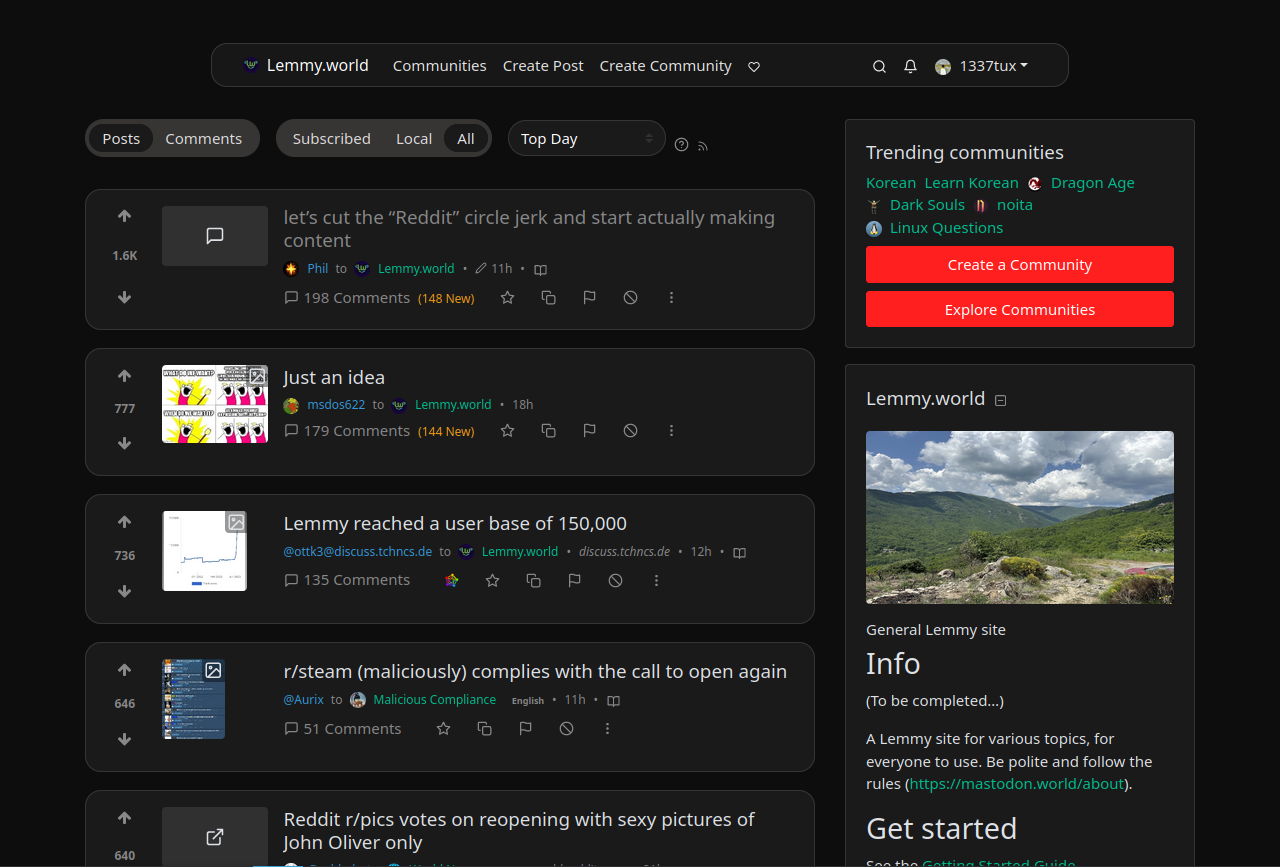
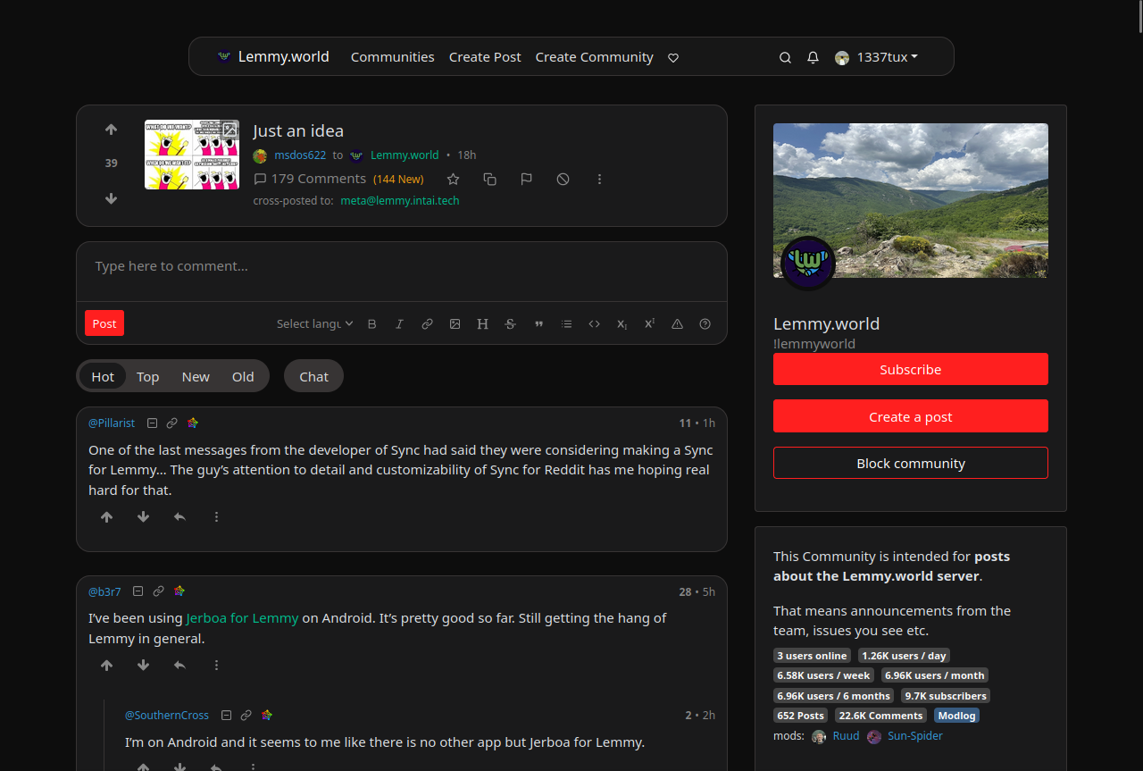
Reddit refugee here.
I have really started to like Lemmy and love the fact that it’s free and open source, but I wasn’t feeling so home with the UI, so I found nice looking style from https://userstyles.world/style/10345/lemmy-world but I personally prefer dark theme so I adjusted some colours and made the radiuses and margins bigger. I thought that maybe someone will find this useful and hence I decided to post it here. I am not a professional programmer, just a guy who likes to tinker with computers so this style may not be perfect. Critique, feedback and suggestions are welcome.


I dont like the wasted vertical space at the top. Regardless, I think it does indeed look better overall, specially the visibility of the cards. Have you thought of doing a PR for this in lemmy-ui?
I haven’t yet thought so far, because this was just a personal little project, but I will think about it. I will probably just keep tinkering with this and try to make it better and maybe try to document this little bit
I would honestly look into creating a new PR. Check to see if they would rather this as a new theme or just the default thing… Please do it! Defaults are important, not many people are going to be adding a new CSS…